top of page


CASE STUDY • FINTECH • AI • 2026
AI powered pre payment insight for UPI
Turning a routine UPI payment into a moment of financial awareness - before the money leaves the account.
By Yash Mewati
.png)
ROLE
Product Designer (Solo)
TIMELINE
3 Days
Aug -2026
MODEL
Concept · Hiring Assessment
PLATFORM
Mobile
SCOPE
End to End
Research → Flow → UI → Prototype
STAKE
Figma
I am Building
An AI powered pre payment insight layer inside a UPI payment flow, showing users their spending pattern and category context in real time, before they confirm a payment.
Why?
Everyday UPI users complete dozens of small payments a month with zero visibility into their own spending behavior at the moment it matters. Every existing solution shows this after the fact, through statements or a separate insights tab. This concept solves it at the one moment awareness can actually change a decision - right before the money leaves the account.

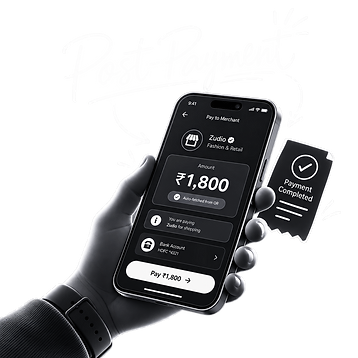
Why Pre Payment, Not Post Payment
I intentionally placed the AI insight before payment confirmation, not after.
Why?
Post payment insight is reflective, it tells the user what already happened, and by then the decision is already made. Pre payment insight is the only point in the flow where the user still has agency. Placing intelligence here turns a routine, automatic action into a brief, informed pause, without adding a mandatory extra step or breaking the speed UPI users expect.
Why This AI Concept/Idea
The AI silently identifies spending category from the merchant and transaction context, and surfaces two to three relevant insights, without requiring the user to input or tag anything manually.
Why
Most finance apps treat AI as a chatbot bolted onto an existing flow.
I wanted AI to work ambiently, in the background, doing the categorization and pattern recognition the user would otherwise have to do manually inside a separate app. It appears exactly where the user already is, inside the payment moment, rather than asking them to go find it.
Why This Is Useful for Users
It closes the gap between spending and awareness without adding friction, letting users build financial self awareness through their existing payment habit rather than a new app they have to remember to open.
Why
Behavior change tools fail when they require a separate habit. By embedding financial awareness into an action users already do multiple times a day, the insight compounds naturally over time, without demanding attention it has not earned.

Is This Feasible to Build
Yes, entirely using data any UPI app already has access to. Merchant identity comes from the standard QR or VPA payload at scan time, category can be inferred from merchant name through simple rule based matching, and spending history already lives in the app's own transaction database.
Grounded UX
Good UX decisions have to be grounded in what is actually buildable, not just what looks good in a mockup. I deliberately avoided any feature that would require new permissions, external bank integrations, or statement scanning, because those raise trust and privacy questions that would work against the product's core promise of a fast, frictionless payment. Every insight in this flow is derived from data the app already owns the moment a QR is scanned, which means this is not a speculative concept, it is a feature that could ship inside an existing UPI app without new infrastructure.
Focused Decisions
Key Product Decisions
Three decisions shaped this concept, insight placed before payment not after, category detected automatically with zero manual input, and insight kept optional through a collapsed strip rather than a mandatory screen.
??
Each decision protects the same principle, the core UPI habit of speed must never be broken. Intelligence had to be additive, something a user can glance at or expand, never something that slows down or gatekeeps the actual payment.
Design Selection
A dark, minimal, high contrast visual system inspired by premium fintech products, prioritizing legibility and speed over decorative detail.
??
Given the tight three day timeframe, I chose a design direction that is fast to execute with high polish, rather than an elaborate custom illustration system. A dark theme also suits a payment context, it reduces visual noise, keeps focus on numbers and category labels, and reads premium and trustworthy.
Design Flow
Scan or open payment screen, enter amount with an ambient insight strip appearing automatically, tap to expand into a detailed insight sheet, then PIN confirmation to complete the payment.
??
The flow mirrors the exact structure users already know from every UPI app, so nothing new needs to be learned. The AI insight is inserted at one precise point, the amount entry screen, so it enhances an existing habit instead of replacing or lengthening it.
User Flow

.png)


Tradeoff
I decided to show the AI insight as a small, closed strip instead of a bigger, always-open card. I also decided not to let users manually fix a wrong category in this version. I did this to keep the payment fast and easy to understand right away.
The Cost of This Choice
Every extra thing shown on the payment screen makes it harder to pay quickly. I accepted that some users might not tap the insight at all, because forcing it to always show would have slowed down the app and gone against the fast, simple UPI experience users expect. In a future version, users could fix a wrongly guessed category, but I left that out here to keep this concept focused and simple.
Conclusion
This concept shows that AI in finance does not need a new screen or a new habit. It can live inside something people already do every day, at the one moment when they can still make a different choice.
What This Proves
The best AI does not ask people to change how they act. It works quietly inside what they are already doing. By showing this insight right before the money leaves the account, a normal, forgettable payment becomes a small moment where the person notices their own spending, without slowing them down at all.
CRAFT NOTE
Every illustration, icon, and graphic element in this UI was designed from scratch - no stock assets, no UI kits. The entire visual system, from the category icons to the insight sheet's chart elements, was built specifically for this concept.
bottom of page