
.png)
Year
Feb 2024
Industry
Quick Commerce,
Pune
Job Role
UI/UX
Designer
Completion
1 Month
Project Overview
A Pune-based quick commerce startup needed a complete UI revamp for their multi-service delivery app. The platform supports food ordering, grocery shopping, and pharmacy delivery in a single ecosystem.
The goal was to transform their rigid, hard-coded interface into a scalable, modern, and conversion-focused user experience.
Problem
The existing app suffered from:
-
Hard-coded UI with no scalability
-
Inconsistent layout and visual hierarchy
-
Poor usability and discoverability
-
Lack of trust and clarity in order tracking
-
No design system for future growth
-
Low engagement with ratings, offers, and upsells
Solution
I redesigned the product into a full-fledged, scalable UI system focused on:
-
Faster decision-making & ordering
-
Unified experience across categories
-
Clear delivery tracking & trust-building
-
Higher conversion via contextual CTAs
-
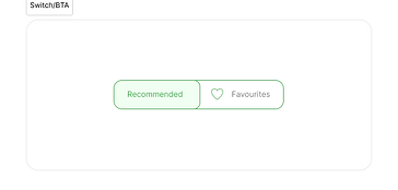
Modular components for future scaling
Splash Screen
Creates brand recall and sets delivery-focused context instantly while keeping load-time perception minimal.

Home Screen
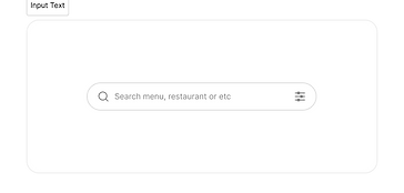
Prioritizes search, offers, and category access to reduce decision time and encourage immediate ordering.
.png)

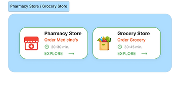
Category Gateway (Food • Grocery • Pharmacy)
Segmented entry points reduce cognitive load and guide users to relevant services faster.
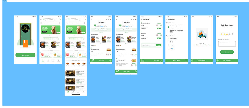
FOOD ORDERING FLOW
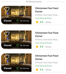
Restaurant Listing & Discovery
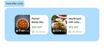
Prioritizes Card-based layout with ratings, delivery time, and offers enables quick comparison and confident selection.search, offers, and category access to reduce decision time and encourage immediate ordering.
Restaurant Menu
Visual hierarchy highlights popular items and offers while maintaining scannability for quick decisions.
.png)
Item Customization (Bottom Sheet)
Users can select size, crust, or add-ons without leaving the page.
Reduces friction.
Order Tracking
Live map + status timeline (Preparing → On Delivery → Delivered).
Builds trust and reduces anxiety.
Cart & Order Review
Shows selected items clearly with edit options.
Transparent pricing increases trust.
Thank You & Rating
Change the text and make it your own. Click here to begin editing.
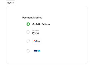
Payment Screen
Simple payment options:
-
Cash on Delivery
-
Wallet
-
UPI
Minimal layout to avoid confusion.
.png)
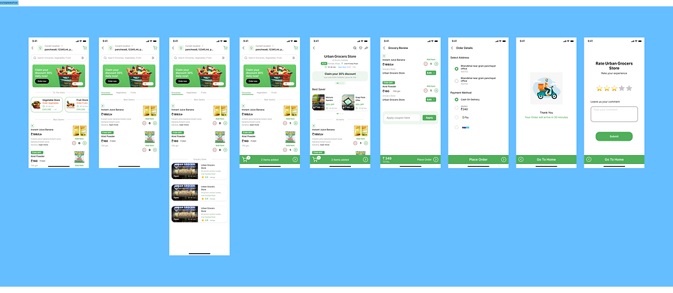
Grocery Flow
The structure is the same as Food.
Only differences:
-
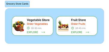
Product grid instead of restaurant menu
-
Quantity selectors are more important
-
Category browsing is deeper
Core Flow:
Home → Store → Products → Cart → Review → Payment → Tracking → Rating
Fast bulk addition and easy quantity updates.
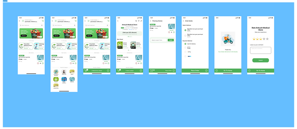
Pharmacy Flow
Again, the same core flow.
Main differences:
-
Medical categories
-
Clear product details
-
Trust-focused UI
Core Flow:
Home → Medical Store → Medicines → Cart → Review → Payment → Tracking → Rating
Clarity, trust, and simple ordering for urgent needs.
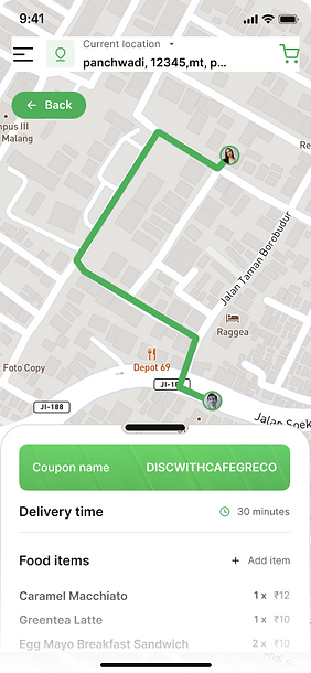
Order Tracking (Shared Across All)
.png)
-
Live map
-
Coupon display
-
Delivery time
-
Order summary
-
Status timeline
Designed to reduce support calls and improve transparency.
Profile & Settings
.png)

-
Wallet balance
-
Address management
-
Notifications
-
Order history
-
Rate app
Simple list layout for easy access.






Thank You
Thank you for viewing this project.
This redesign was focused on building a simple, scalable, and consistent quick commerce experience across Food, Grocery, and Pharmacy while keeping the user journey smooth and efficient.
Project Learning
-
Designing one strong core flow can simplify multiple service categories.
-
Consistency in components improves usability and scalability.
-
Clear CTA hierarchy directly improves user decision-making.
-
Tracking and transparency increase user trust.
-
A proper design system saves time for future product expansion.
This project helped me understand how to design for speed, clarity, and real-world business needs in a fast-moving quick commerce environment.